

Marketing Transformation for a Global Leader
A multi-year engagement to level up digital marketing maturity for a global leader in healthcare and patient services.


A multi-year engagement to level up digital marketing maturity for a global leader in healthcare and patient services.
With dozens of brands, a global master brand, 100+ websites, vigilant legal review, and an army of expensive agencies it should be no surprise that a global leader in biosciences is a complex business with a lot of complex challenges. But with big challenges, comes a big opportunity. An opportunity to rise above the day-to-day hurdles and create a more effective organization that can improve the lives for thousands – if not millions – of people across the world.
This was our remit: to partner with the Digital Excellence department over years to transform ways of working and create new patient experiences that both supported better patient outcomes and bottom line performance.
“We work with purpose to advance science to address the urgent and long-term challenges facing humanity” - Michael Vounatsos, CEO
One of the biggest (and most common) challenges we face is no one single team owns the customer experience (or in this case, the patient experience). It’s typically shared across marketing, operations, and technology teams. This challenge becomes exacerbated when patients and customers have to navigate a brand ecosystem that – in this case – grew over decades without a lot of oversight or strategy behind them.
Understanding the needs of all teams involved and bringing them together to co-create a new, singular vision of the business is the first step we take in large transformation efforts.

While no one team owns the patient experience, we do believe that Marketing is best suited to be facilitators of the vision. As stewards of the brand, it Marketing’s responsibility to look for ways to bring the brand to life in both digital and IRL moments throughout the entire patient journey.
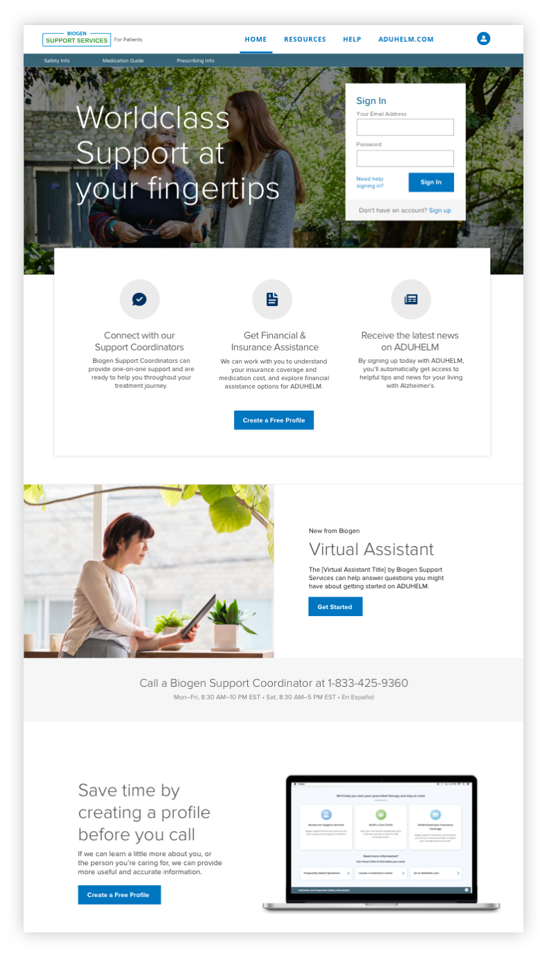
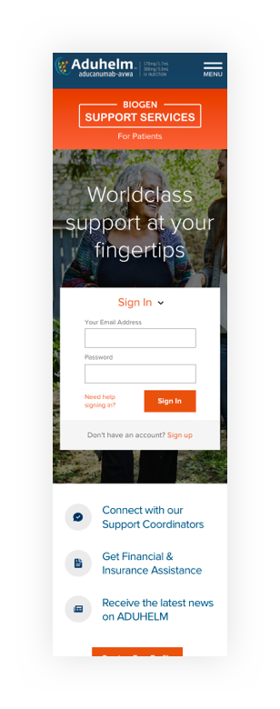
We don’t believe there’s value in creating 100-page strategy presentations that no one outside of the working team understands. Rather, we believe prototyping is significantly more effective in helping teams visualize the strategy, provide us clear feedback, and bridge the gap between strategy and action. We created several end-to-end prototypes that helped tell the story of the vision and communicate it to executive stakeholders.
We don’t believe there’s value in creating 100-page strategy presentations that no one outside of the working team understands. Rather, we believe prototyping is significantly more effective in helping teams visualize the strategy, provide us clear feedback, and bridge the gap between strategy and action. We created several end-to-end prototypes that helped tell the story of the vision and communicate it to executive stakeholders.
“No lie. The hardest part about my disease is ordering my medications.” - Patient Interview
To bring the vision to life, it was important to focus on creating a consistent, simple experience across the entire patient journey – from early digital content experiences to Patient Services interactions. The current state was far from that. Marketing and Patient Services teams were each operating under their own roadmaps (and even branding). The results was a highly fragmented and confusing patient experience that worked against patient/caregiver needs and bottom-line business goals.
We worked closely with marketing, operations, and IT teams to understand the end-to-end patient journey and the all the operational + systems needed to support that journey. The final outcome was a service blueprint that helped translate the new patient experience vision into an integrated roadmap that everyone helped create.

Through the use of digital experiences like chat and the Patient Portal, we were able to find new opportunities to improve scale and alleviate service pressures for onboarding and support.
Previous to our efforts, Marketing and Patient Services had overlapping digital roadmaps. This singular view helped identify the overlap and streamline coordinated efforts.
Since we started with the customer journey and then looked inward, we were able to design a patient experience with less handoffs and eliminate the need for extra touchpoints.
This singular, overarching view helped all teams understand where they needed to integrate better and find top-down opportunities for meaningful change.
Now, we have an aligned vision of business...but that’s the easy part – the hard part was connecting who we wanted to be in two years (vision) to what we need to do today (execution). As part of our Northstar approach, we believe a rigorous effort to prioritize and roadmap (planning) is the key to bridging vision and execution.
The biggest challenge with planning is that the resources, roadmaps, media strategy, and the digital ecosystems were all over the place. Each brand team had their own agency partners which translated into different ways of working, complex digital ecosystems, and unregulated marketing spend that was driven more by agency selling than by true business and customer value.
As a core part of this marketing transformation effort, we worked across all teams and brands to co- create a centralized strategy for connected experiences, media, operations, and the sharing of data+insights.

In the current state, each brand team was independantly responsible for website redesign, new brands, data capture, agency spending, and ways of working without an overarching strategy or governance. The result was a brand ecosystem that was overly complex, confusing for customers, and expensive.

The transformation effort focused on a centralized model that helped brand teams gain efficiencies and consistency while also maintaining autonomy in their brands and content. The result was a streamlined model that tapped into the power of the portfolio to find better ways of working.
MCE (the digital excellence team) was responsible for working across brands and agencies to capture insights, processes, patient/usability research, agency onboarding, and any other content that traditionally siloed teams can share with the broader organization.
We leaned in with marketing and IT teams to capture insights, create content, and develop an the experience on Adobe Experience Manager (AEM). The result was a central destination that helped every work better.
We helped define and publish playbooks for everything from usability testing to development processes to unifiy ways of working across teams.
We helped define and publish playbooks for everything from usability testing to development processes to unifiy ways of working across teams.
Strategy, research, and data reports were published on Insights Central so all teams could benefit from the learnings of other brands.
We developed Channel Guide content to ensure all teams were integrating best practices across web, mobile, and email channels.
Why does every redesign require us to design and build the same thing over and over again? It’s wildy inefficient. We helped design and build a series of shared components that can be branded and reused for any website built on Adobe Experience Manager (AEM). The result was a Global Design System that sped up design and development considerably while ensuring consistency and best practices for UX and accessibility were upheld.
We leaned in with marketing and IT teams to capture insights, create content, and develop an the experience on Adobe Experience Manager (AEM). The result was a central destination that helped every work better.
With a proper component system, creating designs and building websites becomes a matter of assembling building blocks than it does rebuilding everything from scratch.
Getting legal and compliance sign-off at the component level means we can eliminate redundant legal review for common content in the design and build phase.
Templates are often too strict for the needs of brand owners, but component systems let brands create purpose-built layouts and content with shared components.
Establish patterns and functionality ensure that UX and accessibility best practices are consistent across applications.
With a strategic vision, roadmap, and media architecture in place, we worked across dozens of efforts in design, content, and build activities knowing that everything we do ladders up to a broader strategy.
BiogenOptions.com is the entry point experience for those comparing treatments within the Biogen family. We partnered with Accenture to design, review, and launch BiogenOptions.com with an emphasis on lead capture and data.
Biogen's Symposia events are a global effort designed to reach HCPs around the world. We designed and supported launch activities under an aggressive schedule to support a major annual milestone.
This was large effort to introduce chat features across the brand portfolio. We helped research, design, and get legal approval for the initial pilot on Tecfidera.com.
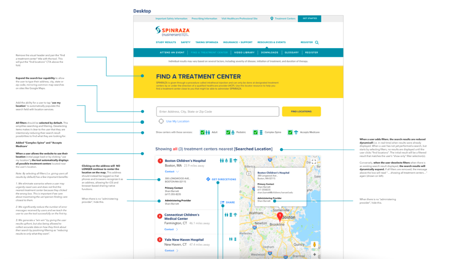
We redesigned Spinraza.com in order to improve UX best practices, increase performance on key success criteria, and bring the site onto the new design and component architecture.
This was a new treatment launched in 2020 and gave us the opportunity to think fresh. We used this as an opportunity to better connect marketing and Patient Services outcomes to deliver a seamless patient experience.
We partnered with Brand, Patient Services, and IT teams to communicate the Patient Portal value proposition and better bridge the gap between awareness, acquisition, and onboarding.
This was a very large effort to assess current accessibility gaps and provide a global framework to guide future design, content, and development activities.
In order to bring the voice of the patient into the business (and bring costs down), we developed the User Testing Playbook and executed all usability research across the brands.
The Access Toolkit was an essential resource for HCPs so we designed a useful, usable resource center to make sure HCPs – and their admins – could get the content and resources they need quickly.
Our small, senior team model proved to be extremely successful in shaping a transformation effort that rivaled those of the big 4 consulting agencies. We shaped a strategic vision across brands, simplified an enormous digital ecosystem, established new ways of working, and designed experiences that were useful, usable, and noteworthy. We helped lower bottom-line costs, increase speed-to-treatment, and – most importantly – improve the lives for thousand of families by helping them find the treatments right them and support loved ones.
For us, it truly was world-changing work.